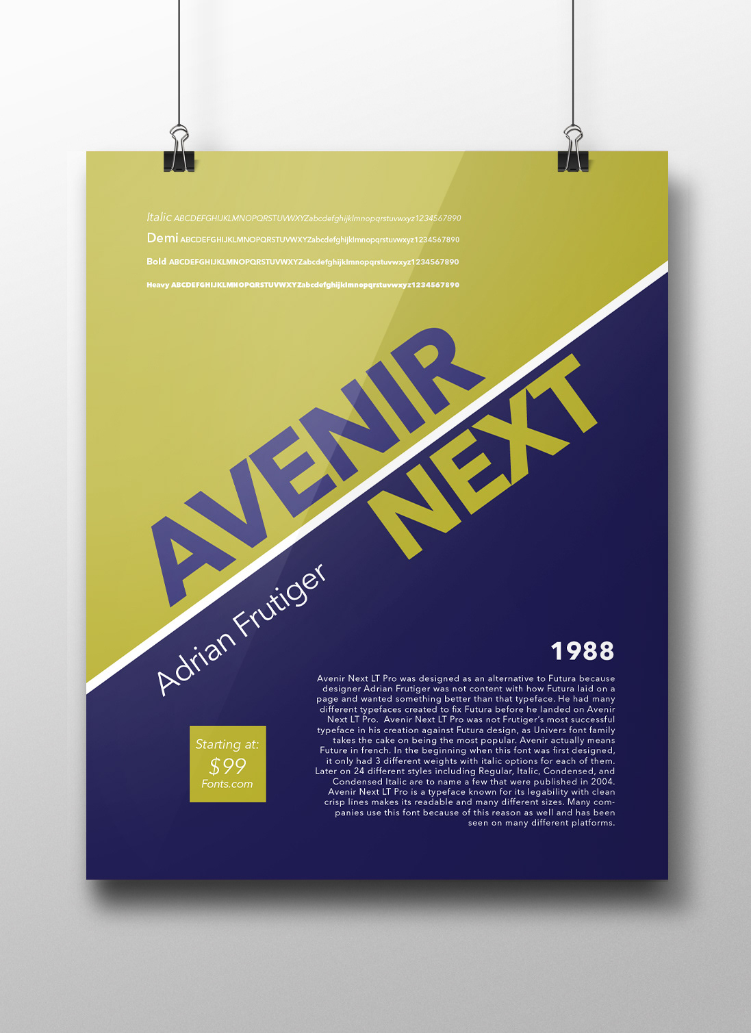
Font Specimen Poster
This poster was created on behalf of fonts.com to help market to other graphic designers the font Avenir Next LT Pro. This poster was created to show what this font has to offer. The different weights of the fonts are displayed as well as the history of the font. The price is in the corner with the website to be able to find the font.
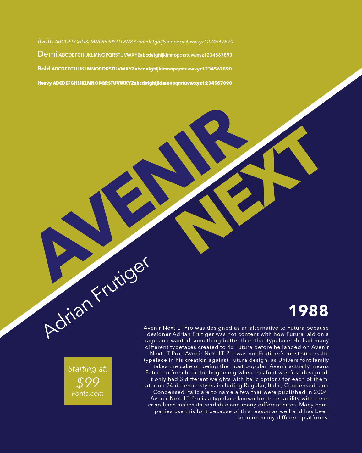
Hierarchy and Alignment were major components when creating this poster. The name of the font is the focal point of the poster as it is what we want the viewer to remember. Other information on the poster is varied in weight depending on the importance of the information. The color variation is used to show visual interest and eye-catching detail. We used different weights and caps lettering throughout the poster to show the difference in the weights within the font. This poster will be a great addition to fonts.com marketing team and will help promote Avenir Next as a font designers will want to use.
Posters are designed to be both eye-catching and informative. -https://en.wikipedia.org/wiki/Poster