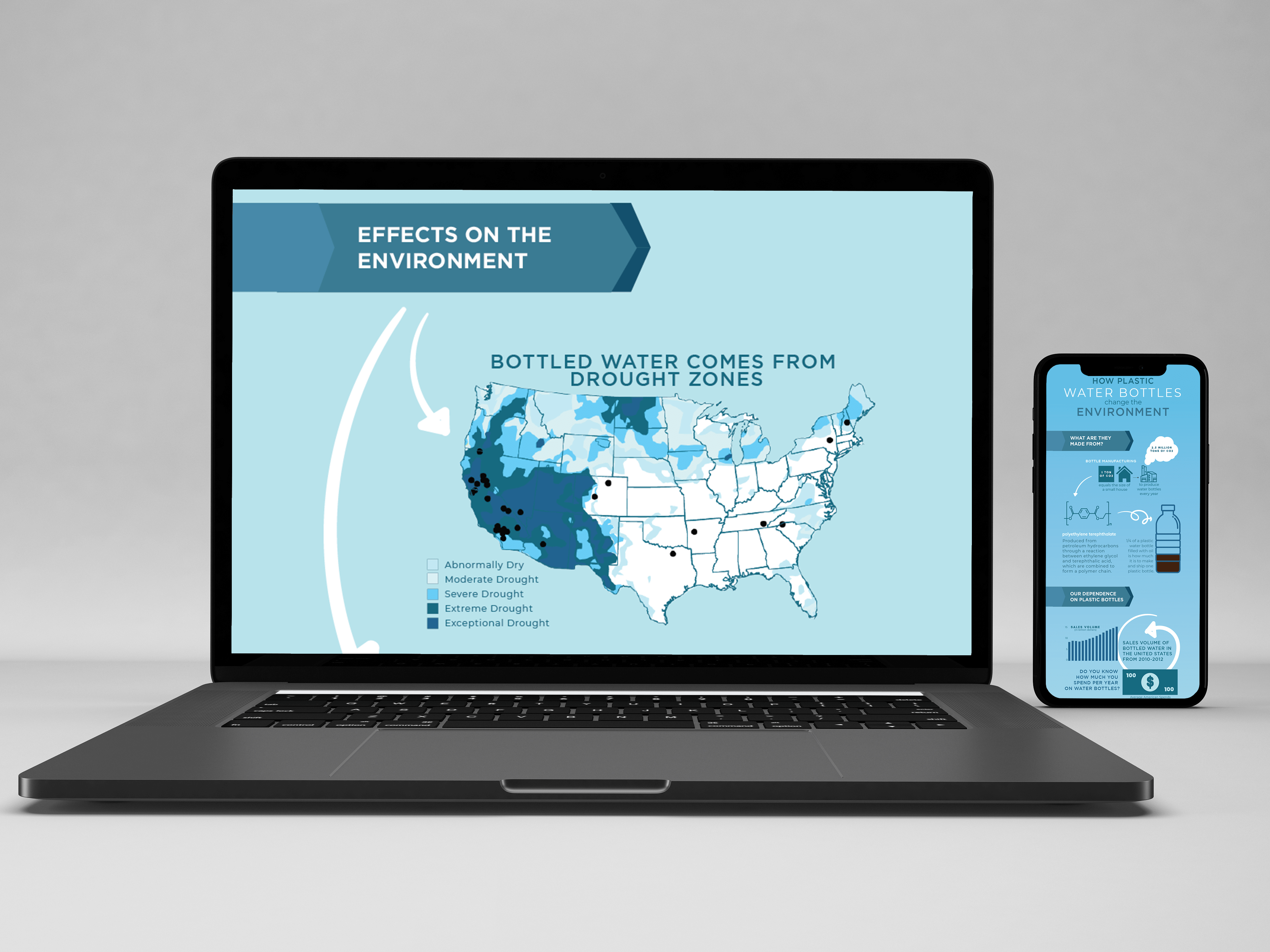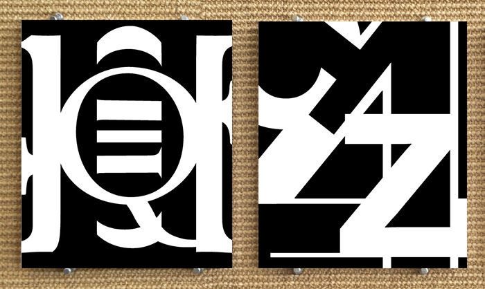
Character combination project with the serif composition on the left and the sans serif composition on the right.
For this project, I created two typographic compositions illustrating the principles of design while staying within set specifications. My composition is meant to be fluid and where all parts come together to make one composition. Only letterforms or glyphs were used to make the compositions using only 2 fonts. The serif font used in one composition is Stempel Garamond Roman and the sans serif font used in the other is Neue Haas Grotesque Bold. The compositions were to be 6.75 x 8 inches tall. Each piece contains different glyphs and includes different elements of the typographic anatmony including: a stem, spine, bowl, an ascender and descender. All glyphs had to be either black or white. This project showed personality of the fonts and also from me as a designer.
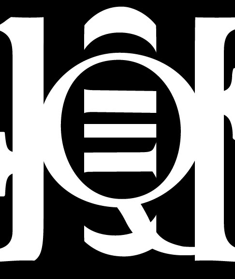
This is a serif composition using Stempel Garamond Roman Font.
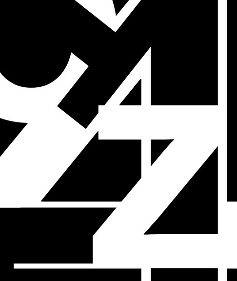
This is a sans serif composition using Neue Haas Grotesk Bold font.