Each book has a story. Book covers are a wonderful way to express this story and the meaning behind the book.
In this project, I was ask to celebrate a classic book of all time and give it a new cover that uses design principles. The three different covers needed to showcase the meaning behind the book. The first was using typography. The second was to use a physical item to represent a meaning or purpose in the book. The third was left up to the designer to figure out the best direction. Here are the book covers I came up with from the classic book, "The Wizard of Oz" by L. Frank Baum.
Typography:
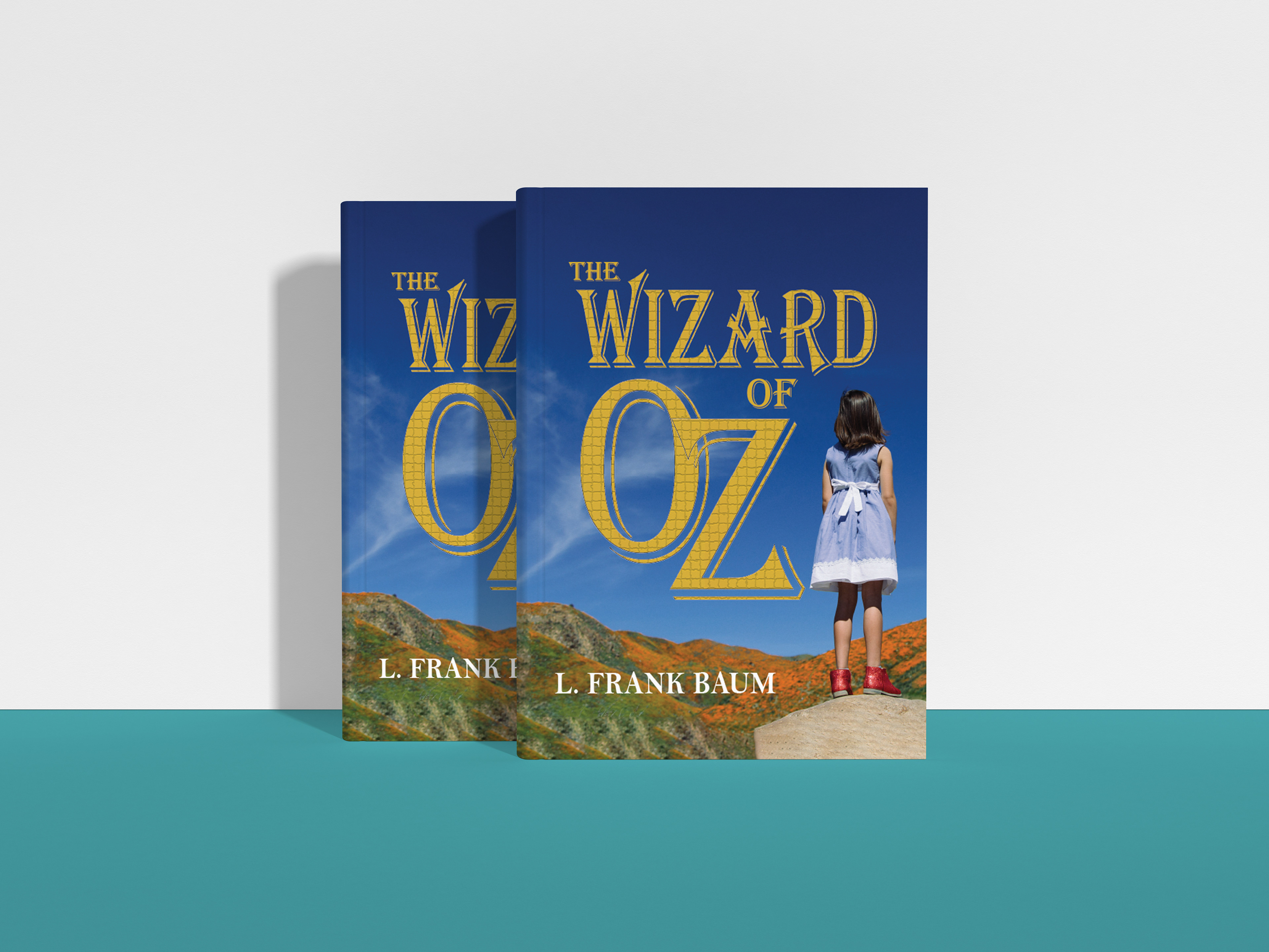
This cover showcases typography in making it look like the yellow brick road that Dorothy has to follow to learn her way home. Throughout her journey on this yellow brick road, she learns things about herself she did not understand before. This works so well for this book cover as the background is a young girl and the yellow brick road is the symbol of her growing into a women.
Physical:

This cover works well for the physical book cover because the greatest lesson Dorothy learns through her journey is that she has had the power the whole time to take her home in her red ruby slippers. This is why they are my physical item in the front and foremost of the design. The castle of Oz is within the O for a reason. It is about perspective. It looked like Oz was her only way home but when she got the perspective she needed she realized it was just a pretty castle in the distance and didn't really hold any power. The cover has a mythical and magical feel to it just like the feeling you get while in the land of Oz. This cover showcases the greatest parts of the book, The Wizard of Oz.
Designer's Choice
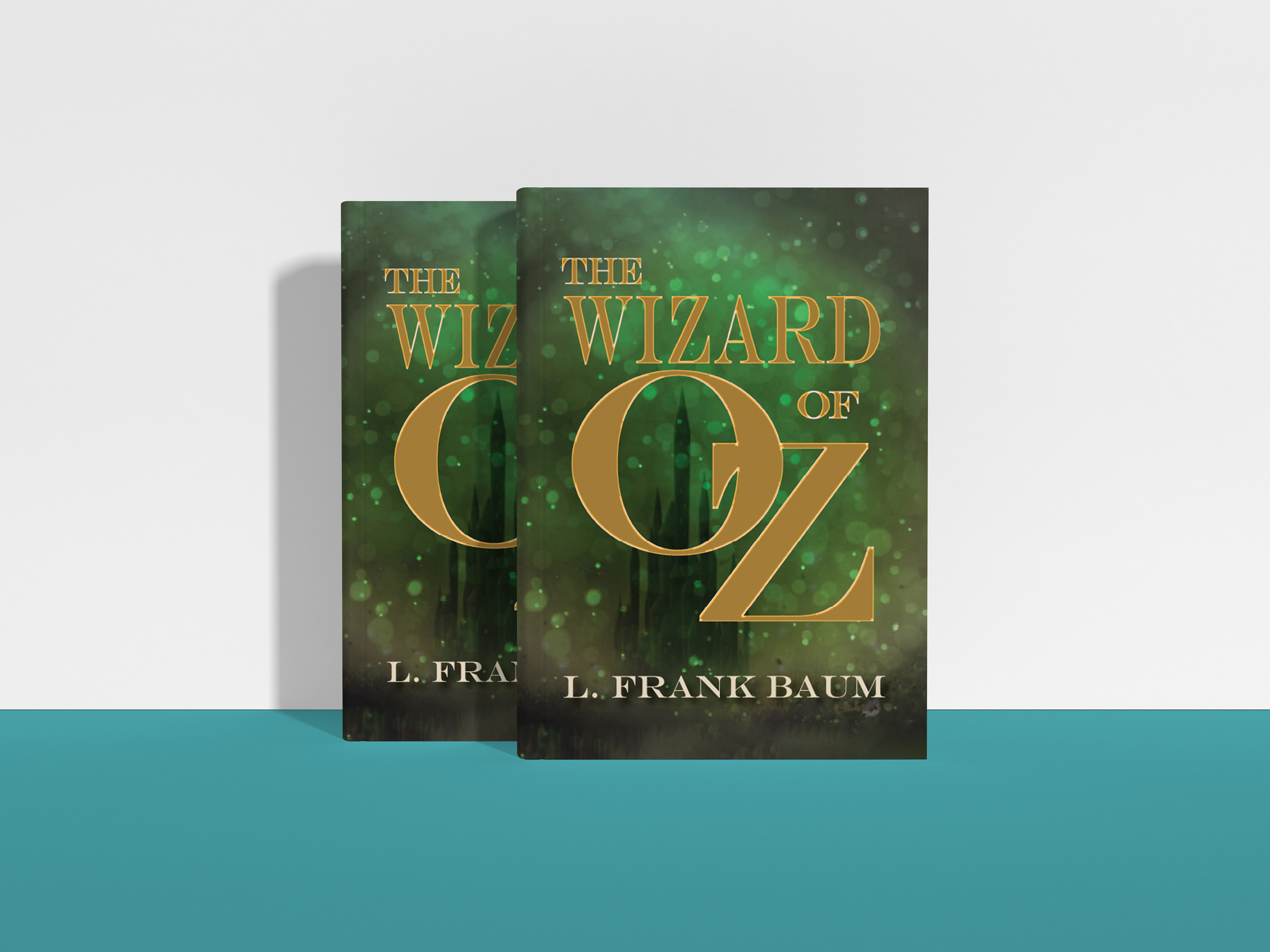
This cover was fun to design. I wanted to have the castle of Oz in the background as it was about perspective of what power Oz really held for Dorothy. The sides of the cover are also darkened to show this perspective a little more. The gold glitter around the cover showcases how we can become slightly blinded by the magic in front of us that we lose our most important trait, the power within us. Sometimes in our lives, we tend focus on the things that grasp our attention the most. However, we come to find out that we have the strength within us to become exactly who we want to be. This is exactly what happened for Dorothy and is exactly what this book cover represents.
Overall, these covers showcase the main important meanings behind the classic book, The Wizard of Oz. They helped me grow as a designer as it takes time to understand meaning behind a design and then to be able to showcase this meaning. This is something that will help me become better to understand what clients want when given a project and being able to help design the direction they want to go.